
Blog - About Newsletters
- Published in Blog
- Be the first to comment!
Newsletters are being written to be read. If nobody would want to read your newsletters, you would quit writing them sooner rather then later.
There are a couple of important steps to go from writing your newsletter, to having someone receive it, open it, and actually read it.
Once you send your newsletter, it needs to be delivered to the inbox of your recipients If it ends up in a spam folder, there is little to no chance it will ever be read by this recipient.
For getting your newsletter delivered to the inbox instead of to the spam-box you will need to get past the spam filter of the recipient his email service provider. This can be a difficult process, but normally this would be handled by the Newsletter sending service provider you have chosen for this task. If you want to handle this yourself, then you are in for a challenge.
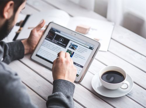
After your newsletter has been delivered to the inbox of your recipient, it still needs to be opened, and read.
First you will need to pull your recipients attention to your email. This you do with a recognizable sender email address, and with a catchy Subject line. Once your recipient clicks your email, it will need to capture his attention with short and catchy snippets of text which have to make him want to read the full newsletter, or at least some interesting articles for him. If you fail to catch his attention during this phase, he will not open your newsletter, but just click through to the next email in his inbox. You will have lost him then for this newsletter.
After you have caught the attention of your recipient, and he opens your newsletter, then he becomes your reader.
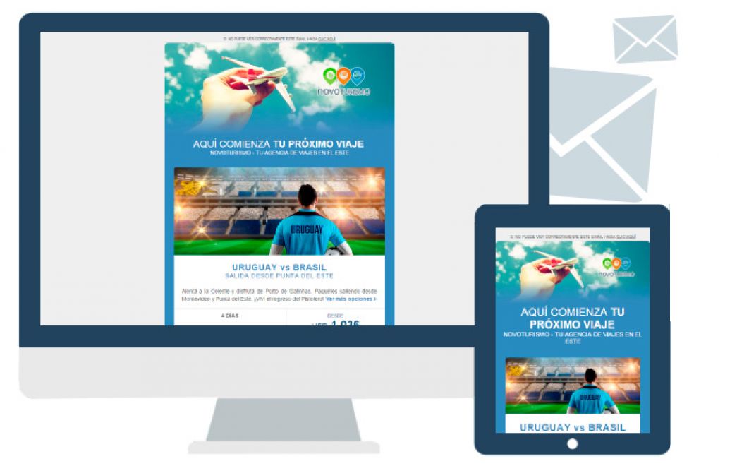
At this stage you will have to keep his attention, so that you can deliver your full message to him. This is where the design of your newsletter plays its major role. Assuming you have a message for your reader that he is actually interested in, you will have to present it in a fashionable way, and one that is actually compatible with the application your reader is using for reading your Newsletter.
This is where the design of your Newsletter and the quality of the HTML conversion of this design plays its major role.
If your design is not attractive to your reader, or the layout is messy or the articles are not to-the-point enough, then even at this point you could still lose your reader. So keep your texts nice and short, and quickly link to a full size article somewhere on the web.
A messy layout can be prevented by using professional designers, and professionals who convert your design into HTML code.
These professionals will make sure that your newsletter looks good on both a modern mobile browser on an iPhone or Android device, and on an ancient Email client like Outlook 2003 - which was actually first released in 2003, with the current technology from 2003..!
The special coding techniques need for building your email template cross-browser compatible between old 2003 technology, new responsive technology from cell phones and tablets, but also on online email clients with major market shares like Gmail, Outlook.com (was: Hotmail.com), Yahoo Mail, and various other email clients is not something you can learn quickly. This is done by true specialists.